Some album covers stop you mid-scroll, and you cannot quite explain why.
Pink Floyd had that effect on people long before the internet made aesthetics a whole conversation. Their records were designed to be felt, not just heard, and the artwork was always part of that experience.
The creative studio behind most of it, Hipgnosis, had a way of turning a simple image into something that lingered.
Every cover in their discography carries that same quiet depth, and once you start looking, it is hard to stop.
Evolution of Pink Floyd Album Art
Pink Floyd’s visual identity did not stay in one place for long. As the band evolved musically, the artwork kept pace, sometimes even leading the way.
Each decade brought a different mood, a different intention, and a completely different way of making you feel something before the needle even hit the record.
| Era | Visual Style | Mood | Key Influence |
|---|---|---|---|
| 1960s | Psychedelic experimentation | Chaotic, trippy, raw | Early counterculture and acid rock |
| 1970s | Conceptual and symbolic | Bold, intentional, layered | Hipgnosis at their peak |
| 1980s to 1990s | Surreal photography and minimalism | Quiet, unsettling, personal | Post-Waters creative shift |
| 2010s | Atmospheric and reflective | Nostalgic, meditative, soft | Legacy and looking back |
2010s Era
The final chapter of Pink Floyd’s visual story is quieter, more contemplative. The artwork from this era feels less like a statement and more like a farewell written in watercolor.
2014: The Endless River

Painted by Ahmed Emad Eldin, the cover places a lone rower on a vast, cloud-like river, weightless and directionless all at once.
It perfectly mirrors the album’s nature, which was built from instrumental sessions recorded alongside Rick Wright before his passing. There is no destination implied, only the drifting.
The palette is muted, almost dreamlike, and the absence of anything sharp or defined feels intentional. It is grief rendered as landscape.
1990s Era
Pink Floyd, without Roger Waters, had already proven itself by this point. The artwork of this era carries a quieter confidence, more sculptural, more philosophical, and still deeply symbolic.
1994: The Division Bell
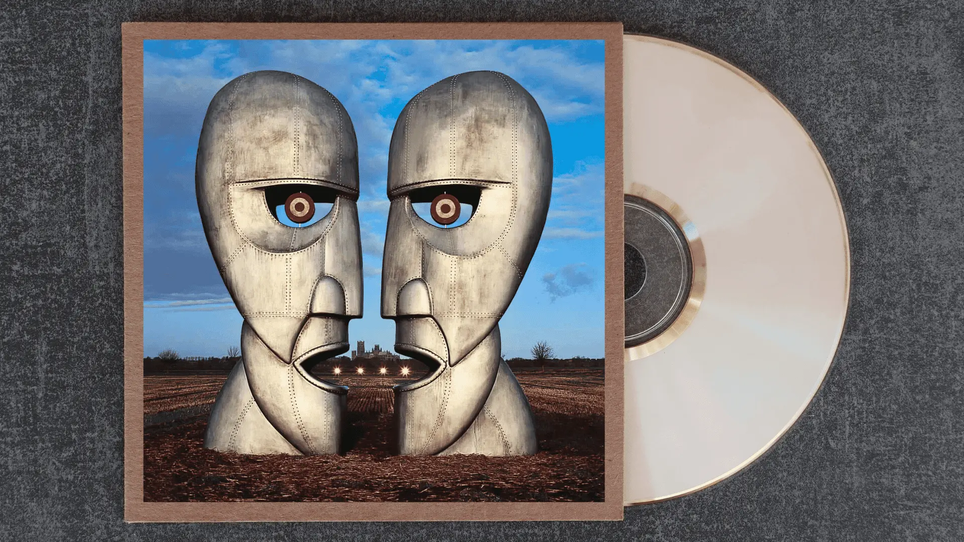
Storm Thorgerson designed two enormous metallic heads facing each other, and if you look closely enough, the negative space between them forms a third face. It is one of the most layered visual metaphors in rock history.
The album is about communication breakdown, and the cover literalizes it without being obvious.
The heads are close enough to touch but locked in permanent separation. Cold material, warm obsession.
1980s Era
This era carries the tension of a band redefining itself. The covers reflect that friction, surreal, politically charged, and sometimes deeply uncomfortable in a way that feels completely deliberate.
1987: A Momentary Lapse of Reason

Hundreds of hospital beds lined up across a foggy beach with no humans in sight. Thorgerson conceived the image as a response to Roger Waters publicly declaring the band was finished.
The emptiness is the point. It is clinical and eerie, a visual argument that something survived even when the soul seemed to have left.
The scale of it, all those beds stretching toward the water, makes it genuinely haunting.
1983: The Final Cut

This was Roger Waters at his most personal and most wounded. The cover art reflects that, war medals pinned to a military uniform, rendered with a kind of quiet fury.
There is no abstraction here. It is direct, almost confrontational. The album mourned the broken promise of post-war Britain, and the artwork does not soften that grief at all.
It is one of the few Pink Floyd covers that asks nothing of your imagination.
1970s Era
This is the era that made Pink Floyd synonymous with visual storytelling. Every cover from this decade is a masterclass in concept art, and together they form one of the most extraordinary visual runs in music history.
1979: The Wall

Gerald Scarfe’s cold white bricks against a flat background are almost aggressively simple for a double album of such scale. That restraint is entirely the point.
The wall is a psychological barrier, and the cover gives you nothing to hold onto, no warmth, no entry point.
It mirrors the album’s central theme of self-imposed isolation so precisely that the design and the music feel inseparable. Minimalism as emotional architecture.
1977: Animals
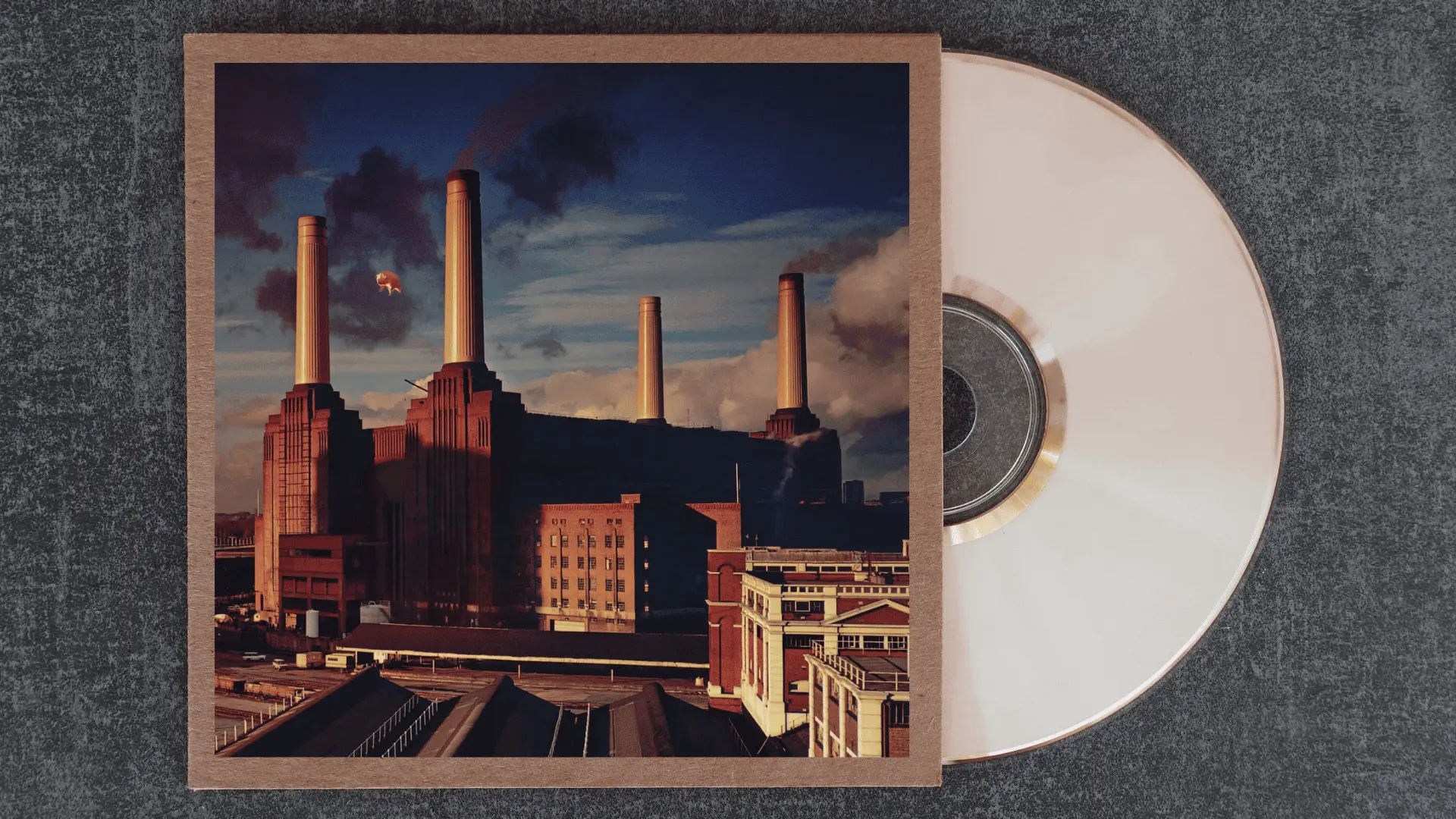
Roger Waters wrote the album as an Orwellian critique of class and capitalism, and Hipgnosis made it visceral by floating a giant inflatable pig above the very real, very industrial Battersea Power Station.
The image is absurd and funny until it is not. The pig drifting between those four chimneys reads as both protest and dark comedy.
It is one of the most politically loaded album covers in rock, dressed up to look like a joke.
1975: Wish You Were Here
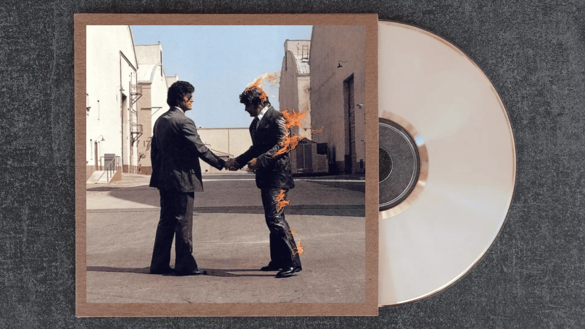
Two businessmen shaking hands while one burns, shot in the California desert with a real stuntman.
Hipgnosis built this image around the idea of industry consuming the human spirit, a direct response to the music business and what it had done to Syd Barrett.
The fire is not metaphorical; it is right there, and yet the handshake carries on. The normalization of that exchange is what makes it so quietly devastating.
1973: The Dark Side of the Moon

Storm Thorgerson wanted something that felt clinical, geometric, and ambitious all at once.
The prism splitting white light into a spectrum against pure black became one of the most reproduced images in popular culture.
What makes it extraordinary is its restraint. No band name on the front, no clutter. Just physics as philosophy. Light enters, passes through something, and comes out changed. The album does exactly the same thing.
1972: Obscured by Clouds
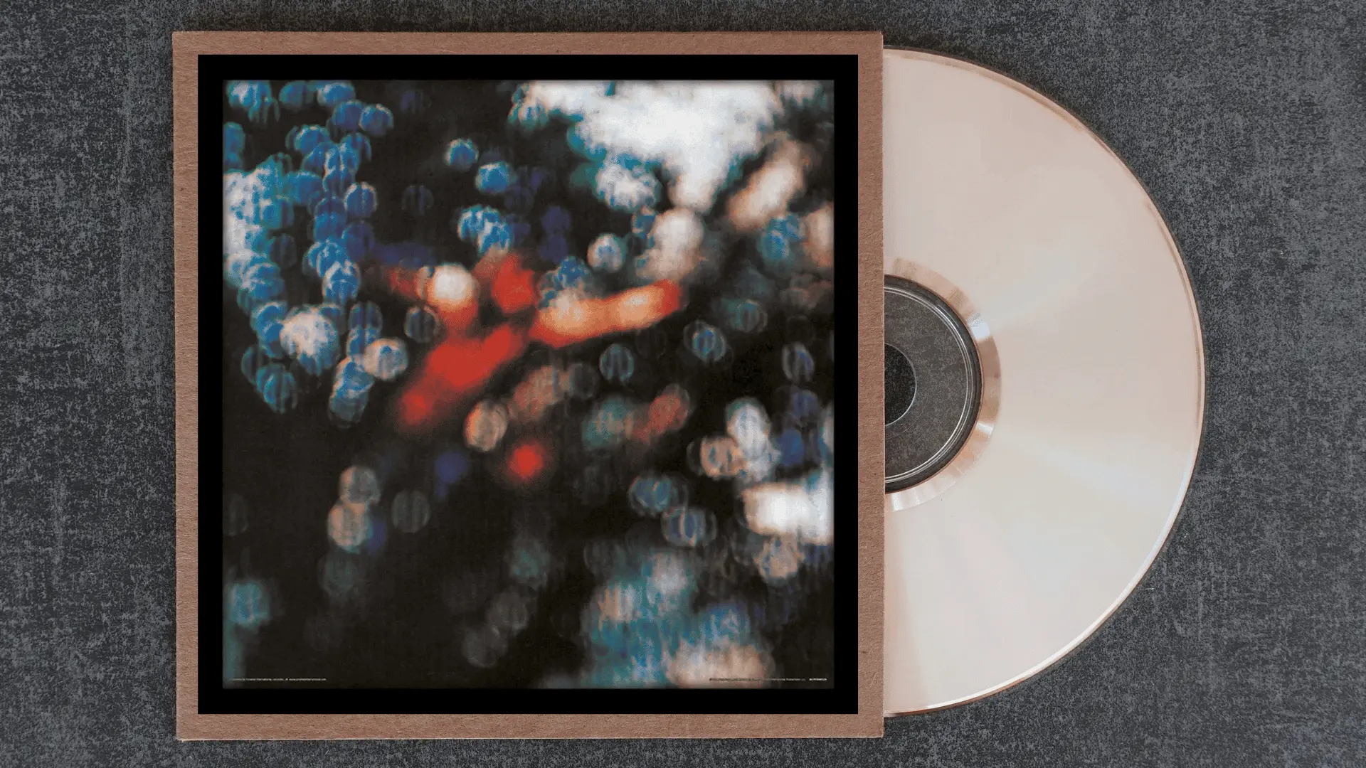
Shot as a film soundtrack cover, the blurred, out-of-focus figure pushing through light and shadow was never meant to carry the weight of a landmark release.
And yet it holds up as one of their more quietly beautiful covers.
The obscurity is literal and emotional, something half-seen, half-understood. It sits in the discography as a transitional piece, not trying to be iconic, which somehow makes it more interesting.
1971: Meddle
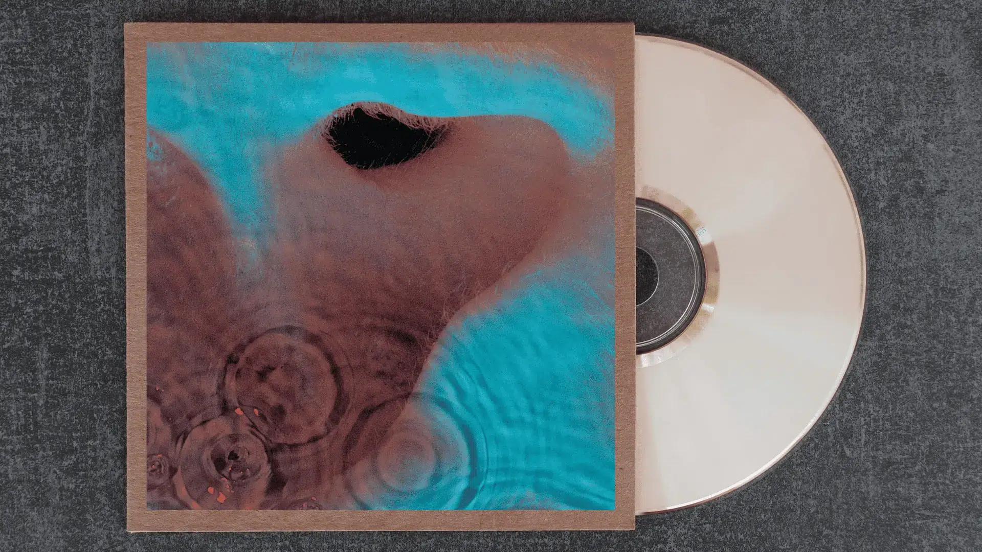
An extreme close-up of an ear submerged underwater, rippled and distorted by the surface above it.
Hipgnosis designed it to visualize the act of listening itself, which, for an album as sonically experimental as Meddle, feels exactly right.
The image is uncomfortable up close, almost clinical, but also strangely intimate. It puts the listener inside the experience rather than outside looking in, which is precisely where this album wants you.
1970: Atom Heart Mother

A single cow standing in an open field. No text on the front cover, no band name, no title. Just a cow.
Hipgnosis pitched it as a complete rejection of everything a rock album cover was supposed to do, and the band agreed immediately. The randomness is the concept.
After years of psychedelic maximalism, the most radical move was to put something utterly unremarkable on the sleeve and dare the audience to sit with that.
Late 1960s Experimental Era
Raw, restless, and wonderfully strange. The earliest Pink Floyd covers were made by a band still figuring out who they were, and that uncertainty produced some of the most visually inventive artwork of the era.
1969: Ummagumma
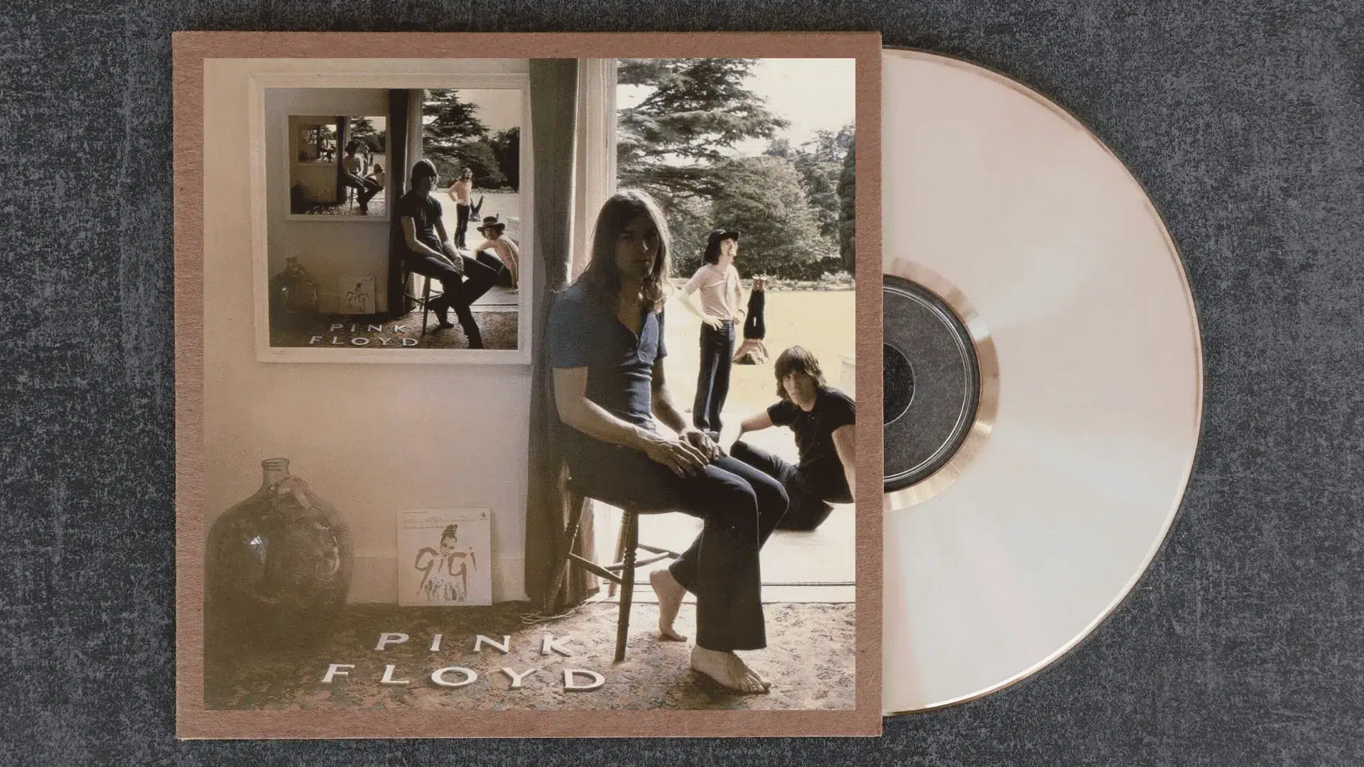
The cover plays with a visual paradox, a photograph within a photograph within a photograph, each frame containing the band with slightly shifted positions.
It is an infinite regression that feels playful on the surface and quietly disorienting the longer you look.
For a double album split between live recordings and solo experimental pieces, the artwork captures the band’s fractured, exploratory state perfectly. Identity repeats until it starts to lose its meaning.
1969: More
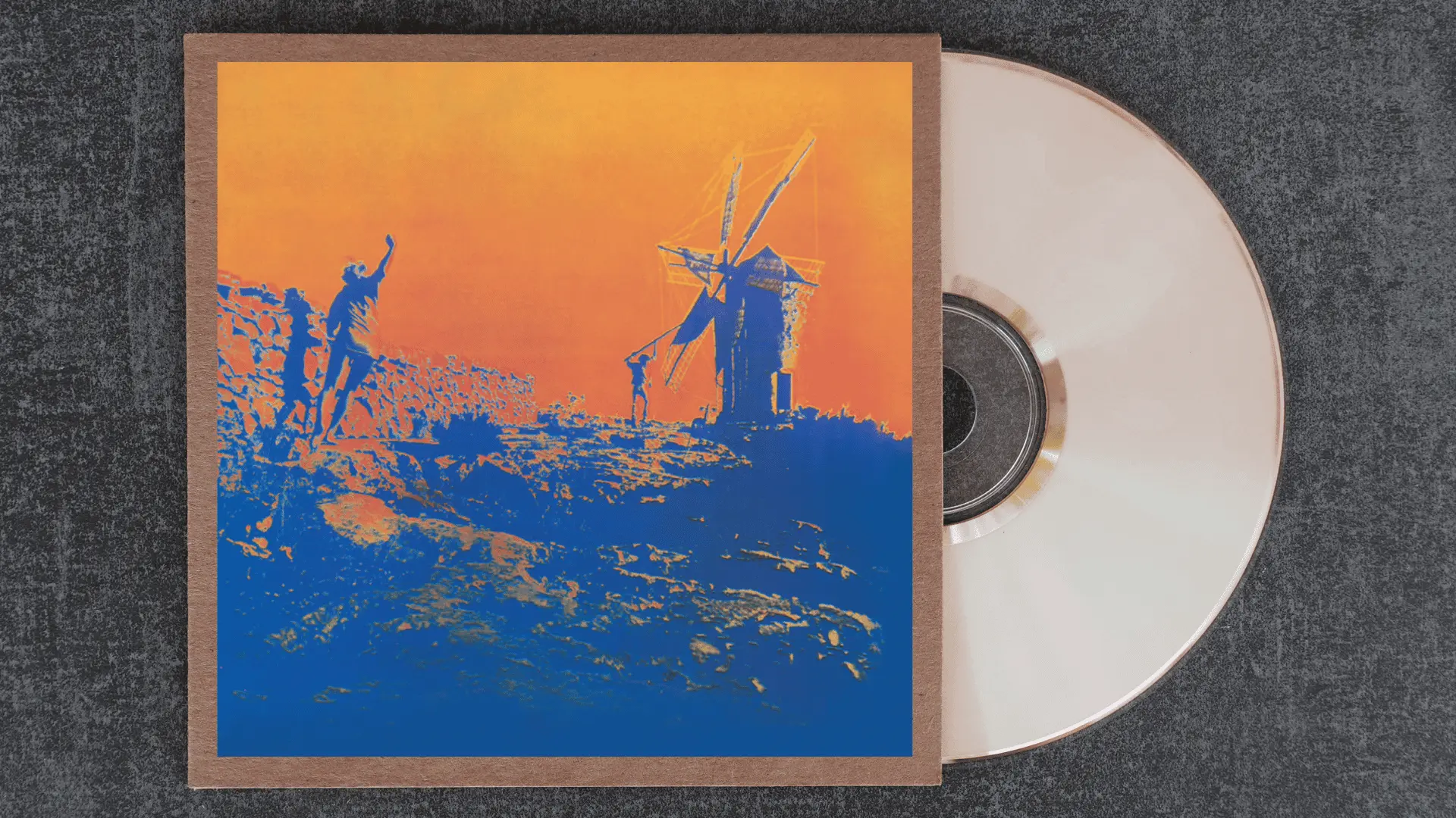
Designed as a film soundtrack, the cover is stripped back and cinematic, with warm tones and a grainy texture that feels borrowed from late sixties European art house film.
It is one of the least discussed covers in the catalog but carries a particular mood, sun-bleached and slightly melancholic.
The simplicity was born of budget and timeline constraints, but it ended up feeling more atmospheric for it.
1968: A Saucerful of Secrets
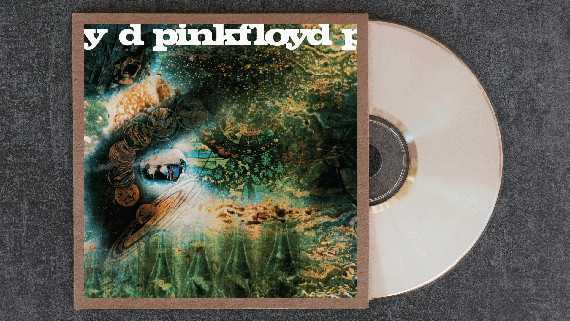
A dense, hand-painted psychedelic collage bursting with celestial imagery, tarot-like figures, and cosmic chaos. It is maximalist in the truest sense, every inch of the sleeve doing something.
Designed by the band’s own circle, it reflects the transitional moment it was made in, Syd Barrett fading out, the band searching for a new direction.
The cover looks like the inside of a mind mid-dissolution, which is not far from what the record sounds like.
1967: The Piper at the Gates of Dawn
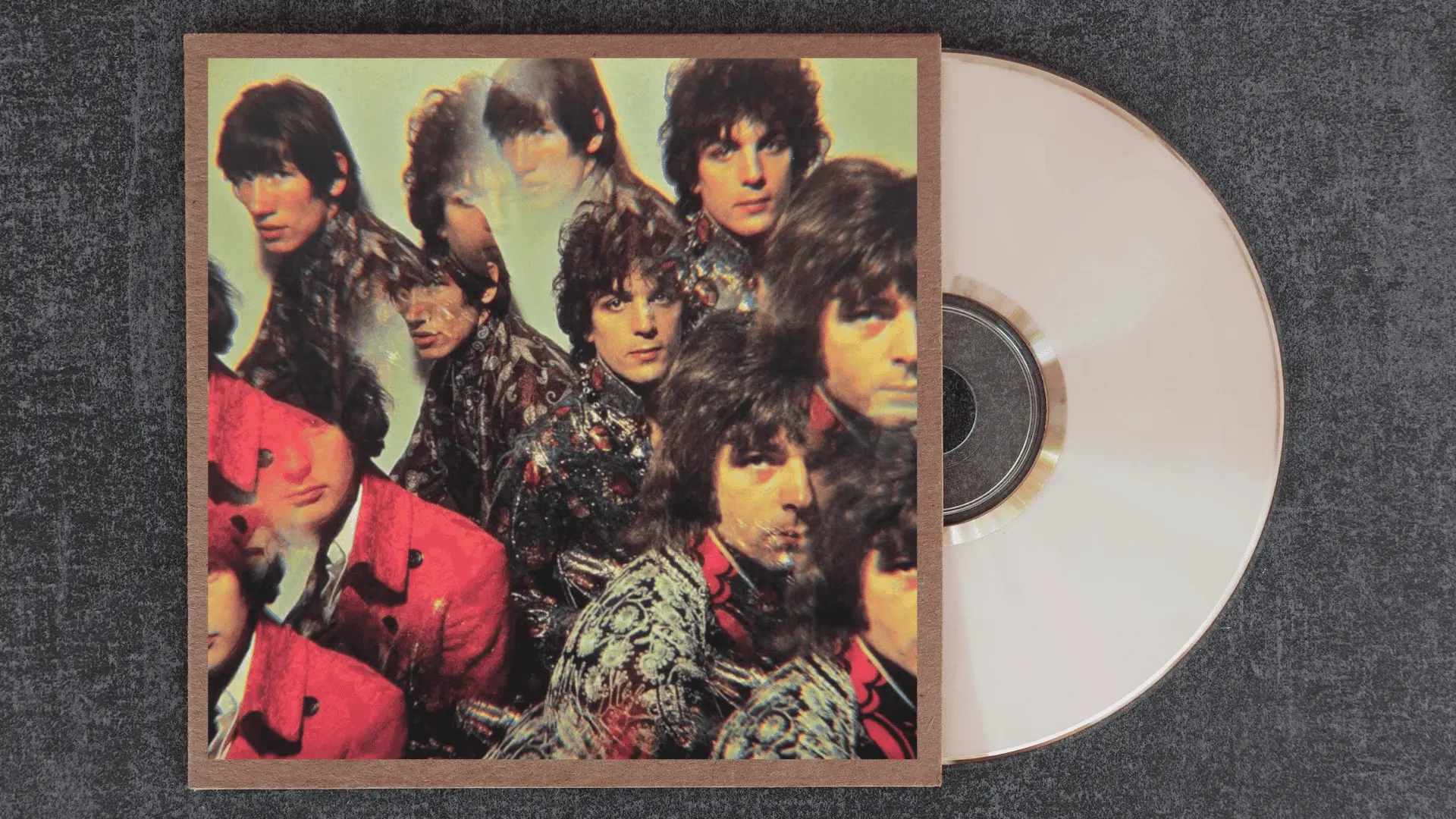
A kaleidoscopic portrait of the band bathed in fractured color and light, it is pure Syd Barrett energy, playful, slightly unhinged, and utterly alive.
Shot by Vic Singh using a special prism lens, the image does not try to look cool. It looks euphoric.
As debut album covers go, it announced something genuinely new, a band that thought in color and sound simultaneously. Everything Pink Floyd became visually can be traced back to this moment.
Who Designed Pink Floyd’s Album Covers?
Hipgnosis, the design partnership formed by Storm Thorgerson and Aubrey Powell, shaped how the world understood album art.
They worked with Pink Floyd across their most defining years, building a visual language rooted in surrealism, concept, and restraint. Their approach was never decorative.
Every image was an argument, a feeling made physical. The prism, the burning man, and the metallic heads did not illustrate the music so much as exist alongside it as equals.
The designers who came after them, across genres and generations, were working in a space that Hipgnosis largely built.
Most Iconic Pink Floyd Album Covers Ranked
Some covers transcend the album they were made for and become cultural objects in their own right. These did exactly that, and the reasons are worth looking at closely.
| Rank | Album | Core Image | Why It Sticks |
|---|---|---|---|
| 1 | The Dark Side of the Moon | Prism splitting light | Wordless, enduring, universally recognized |
| 2 | Wish You Were Here | Burning handshake | Grief and industry collapsed into one image |
| 3 | Animals | Pig over Battersea | Absurdity masking sharp political critique |
| 4 | The Wall | Bare white bricks | Restraint as a design statement |
| 5 | The Division Bell | Two metallic heads | Hidden third face rewards the patient’s eye |
| 6 | Atom Heart Mother | Solo cow, no text | Radical mundanity as concept art |
| 7 | Meddle | Submerged ear close-up | Listening made visceral and strange |
| 8 | A Momentary Lapse of Reason | Hospital beds on a beach | Eerie scale with no human presence |
| 9 | Ummagumma | Infinite photo regression | Identity dissolving into itself |
| 10 | The Piper at the Gates of Dawn | Kaleidoscopic band portrait | Where the whole visual legacy began |
Why Pink Floyd Covers Still Matter Today?
Pink Floyd’s covers never really left. The prism, the pig, and the burning handshake show up on t-shirts, bedroom walls, and Pinterest boards with the same frequency they did decades ago.
These images were designed with enough conceptual weight to mean something outside their original context.
In a streaming era where album art is reduced to a small thumbnail, Pink Floyd’s covers still stop the scroll. They were built for walls, not screens, and somehow that makes them even more striking on one.
The Last Note Lingers
Pink Floyd album covers are one of those rare cases where art and music genuinely needed each other.
The visuals did not support the records; they completed them. Decades later, people are still getting the prism tattooed, still framing the pig, still finding something new in the metallic heads.
Leave a comment below telling us which Pink Floyd album cover has stayed with you the longest, and why.
There is always something interesting that one chooses, and it is rarely the obvious answer.
Frequently Asked Questions (FAQs)
Who Designed Most of the Pink Floyd Album Covers?
The majority were created by Hipgnosis, the design partnership of Storm Thorgerson and Aubrey Powell. They worked with the band through their most defining years and built a visual identity that outlasted the era it came from.
What is the Most Recognised Pink Floyd Album Cover?
The Dark Side of the Moon holds that place, almost without debate. The prism design is one of the few images in music history that needs no text, no context, and no introduction.
Why Did Pink Floyd Put a Cow on an Album Cover?
Atom Heart Mother was Hipgnosis deliberately rejecting every convention of what a rock album cover should look like. The randomness was the entire point, and it worked precisely because it refused to explain itself.
Are Pink Floyd Album Covers Still Relevant in the Streaming Era?
The covers were designed at a scale and with an intention that small screens were never meant to contain, which is exactly why they still feel striking on one. Conceptual depth does not shrink with the format.