Packaging design is often described as the outer layer of a product: the box, the bottle, the color system, or the visual identity that helps an item compete on a shelf. In Jia Yu’s graphic design practice, however, packaging is treated less as a surface and more as a structural tool. Her work uses aesthetics to guide intuition, organize product relationships, communicate functional differences, and shape how users feel before they begin using a product.
That approach is especially visible in her work across skincare and feminine care packaging. One category belongs to commercial beauty and efficacy-driven product systems; the other addresses intimate personal care and inclusive user experience. Yet both reveal the same underlying design method. Jia uses color, typography, hierarchy, graphics, material language, and production logic to make products more intuitive, coherent, and emotionally accessible.
Building a Scalable System for Skincare Packaging
A key foundation of Jia’s packaging practice was her work for HERBORIST DERMA during its 2020 brand renewal and move toward a more independent brand identity. During this period, Jia served as the lead graphic designer for packaging, responsible for establishing a new packaging visual language and extending it across several core new product series.
Public and industry reports placed this stage of HERBORIST DERMA within the context of brand independence and science-driven efficacy skincare. Those reports repeatedly discussed key product series, including the Freeze-dried Ampoule Essence series, Nicotinamide Brightening series, and Hyaluronic Acid Hydrating series. Among them, HERBORIST DERMA’s Polypeptide Firming Freeze-dried Ampoule Essence was publicly described as an important product that opened a new chapter for the brand.
That context placed Jia’s packaging work within a commercially significant period of product renewal, when visual consistency and product recognition were central to how the renewed brand was presented to consumers. Her work was not limited to producing individual packaging layouts. It involved translating the brand’s renewed efficacy-focused skincare positioning into a packaging system that could be recognized, extended, and commercially produced.
The visual language she helped establish needed to work across multiple product benefits, including brightening, hydration, and firming, while maintaining continuity across different retail contexts. That required design judgment across system, channel, and production. Jia used color, typography, graphic elements, and material direction to differentiate product benefits while keeping the series visually unified.
For the Freeze-dried Ampoule Essence series, the packaging language was adapted for different retail contexts. The Watsons Retail Channel version emphasized a brighter and more youthful expression, while the Cosmetics Specialty Channel version adopted a more premium and science-oriented tone. This distinction was not simply a stylistic variation; it reflected how packaging must respond to different commercial environments while preserving the coherence of a brand system.
Across the Nicotinamide Brightening series and Hyaluronic Acid Hydrating series, the system helped translate skincare benefits into visual impressions that consumers could sense quickly, while remaining extendable across the broader product family. This commercial experience demonstrates Jia’s ability to build packaging as a mature graphic design system, connecting brand positioning, product function, production execution, and consumer perception.

Rethinking Feminine Care Through Inclusive Packaging
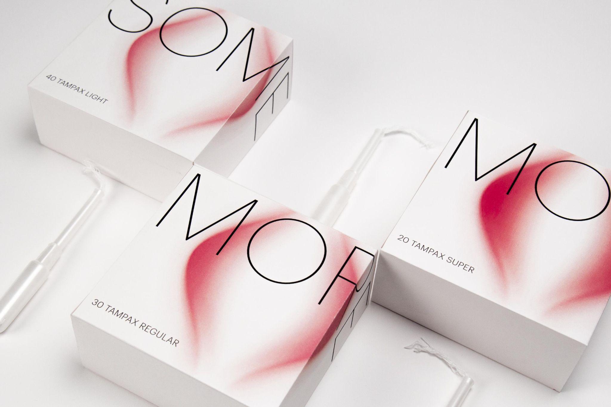
If the HERBORIST DERMA work shows Jia’s ability to build commercial packaging systems, her project When Your Flow Goes Rogue reveals how she applies similar system thinking to a more personal and socially sensitive category. This tampon packaging project received a Silver Award in Packaging Design at the 2025 Indigo Design Awards, a competitive international design competition recognizing bold and innovative work across disciplines.
The project focuses on the emotional experience surrounding feminine hygiene products. Through inclusive design, it presents menstrual care in a way that feels calmer, more respectful, and easier to navigate. Jia’s elegant linework, soft visual language, subtle typographic variation, and clear “some / more / most” absorbency system create a sense of calm and positivity while helping users understand product differences more intuitively.
The design does not treat absorbency as a purely technical label. Instead, it turns product function into an intuitive visual rhythm that feels softer, more direct, and more considerate of the user’s experience. In doing so, When Your Flow Goes Rogue reframes feminine care packaging as a form of user-centered communication: informative without feeling cold, elegant without becoming purely decorative, and inclusive without relying on obvious slogans.
A Practice Connecting Brand, Function, and Feeling
Seen together, HERBORIST DERMA and When Your Flow Goes Rogue show the range of Jia Yu’s packaging-related graphic design practice. In the commercial skincare context, she organized brand identity, product efficacy, retail channels, and production realities into an extendable packaging system. In the feminine care context, she organized absorbency, choice, and emotional experience into an intuitive and respectful visual language.
What connects these projects is not a single surface style, but a consistent design intelligence: the ability to make aesthetics work as structure. Jia’s packaging systems connect brand strategy, product function, material execution, and user feeling. Her strength lies in translating complexity into visual forms that are clear, sensitive, and memorable.
Now working in the United States as a Graphic Design Specialist at IKEA, Jia is extending her intuitive aesthetic approach beyond packaging into retail communication, spatial graphics, and customer-facing visual systems. This broader application of her design practice makes her next stage particularly compelling, as her work continues to show how graphic design can support both commercial product systems and more inclusive, human-centered experiences.