There’s a version of getting dressed that most people practice without thinking about it — the mood of the morning influences the outfit, the outfit influences the bag, the bag influences the shoes, and somewhere in that chain of small decisions a coherent aesthetic emerges that reflects something true about how the day feels. Music works the same way. A playlist isn’t just background. It’s an articulation of a particular emotional register, and the way it shapes a mood is real enough that it bleeds into other choices without requiring any conscious decision to let it.
The phone case sits at the intersection of both of those systems. It’s the most visible personal object most people carry, it’s adjacent to the music in a literal sense — the device the playlist lives on — and it’s one of the few accessories that updates frequently enough to track shifting moods the way a playlist does. Following that logic through to an actual matching principle isn’t a stretch. It’s just paying attention to a connection that was already there.
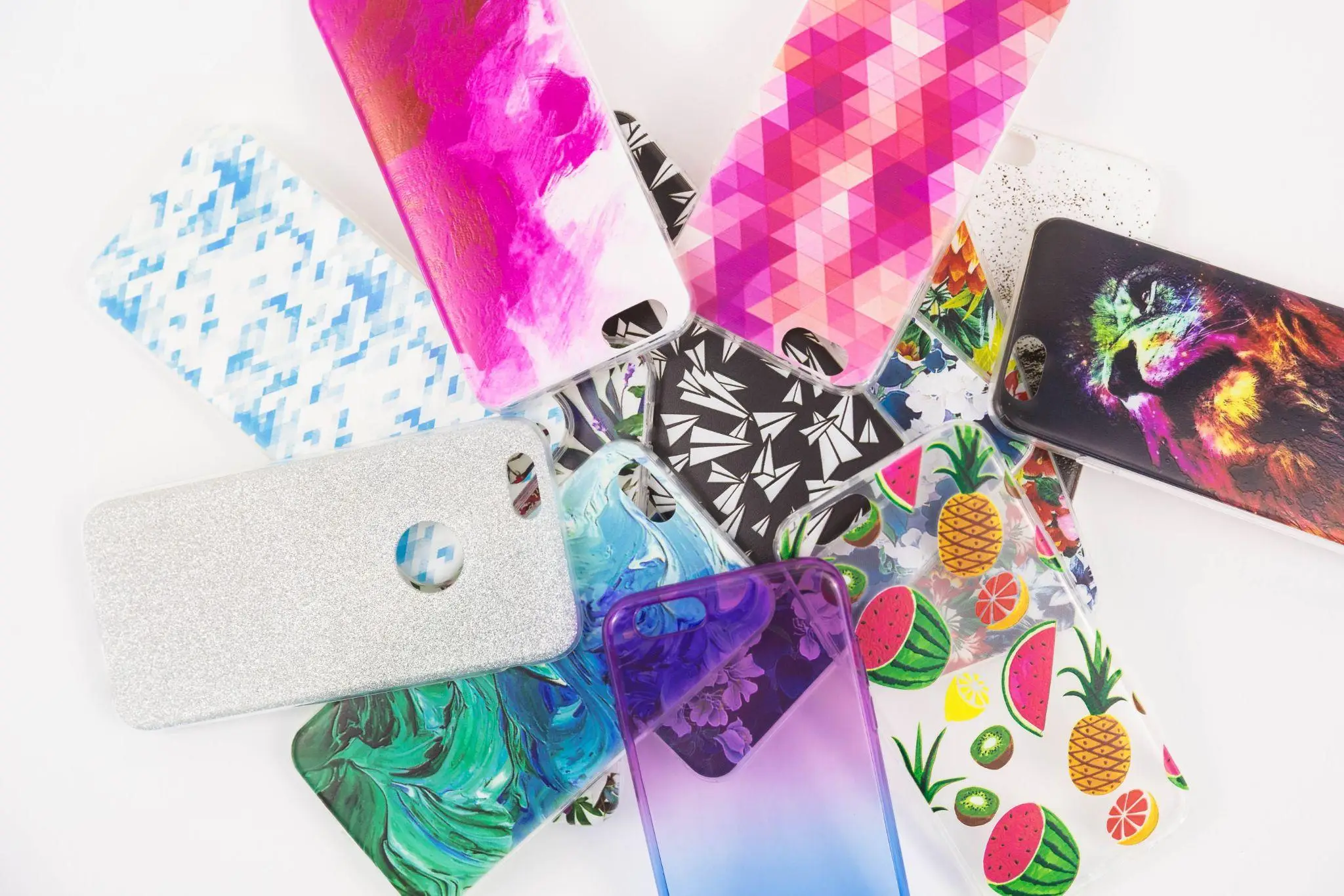
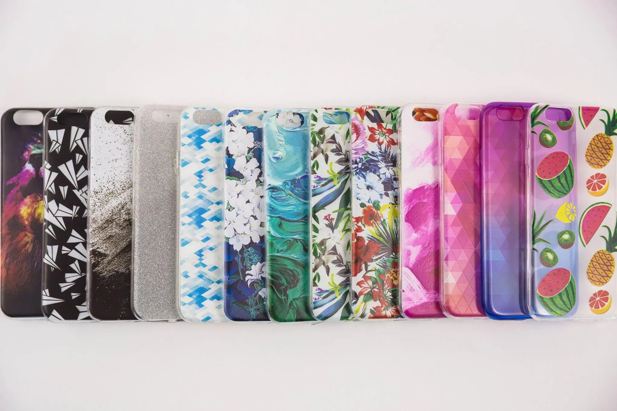
Colorful iPhone cases have made that matching exercise considerably more interesting than it was when the dominant options were black, clear, or the particular shade of beige that case manufacturers once seemed to believe was a neutral. The range of color, pattern, and visual energy available now covers enough aesthetic territory that almost any playlist has a visual equivalent somewhere in the category.
The Energy Match
The most intuitive starting point is energy level. A playlist built around high-BPM tracks, bright production, and the particular euphoric feeling of music that makes standing still difficult has a visual equivalent in cases that lean into saturation and contrast — the ones where the color relationship is active rather than harmonious, where the eye doesn’t rest easily but instead moves across the surface.
The logic runs in the other direction too. A late-night, low-tempo playlist — something that moves slowly and rewards sustained listening — has more in common aesthetically with cases that use color in a more considered way. Gradient colorways that shift gradually across the surface, palettes that choose depth over brightness, patterns with enough white space that the color has room to breathe. The visual pacing matches the musical pacing, which is a form of coherence even if it’s not a conventional one.
Genre as Visual Vocabulary
Genre has always generated its own visual culture, which makes it a useful translation layer between music and aesthetic choices. The visual vocabulary associated with different musical traditions isn’t arbitrary — it developed through album artwork, music video aesthetics, tour merchandise, and the styling choices of the artists who defined particular sounds.
Indie and alternative sounds tend to cluster around a visual palette that favors the slightly faded, the textured, the self-consciously imperfect. The cases that resonate here are the ones with a handmade quality, with pattern choices that feel drawn rather than generated, with a color palette that includes enough muted tones to feel genuinely independent of trend.
Pop — particularly the maximalist, hyper-produced variety that defines the current mainstream — has a visual counterpart in cases that fully commit to brightness and pattern density. No apology for the pink, no restraint on the sparkle, no interest in being subtle about any of it. The music isn’t subtle either, and the coherence between the two is part of the point.
R&B and neo-soul occupy a different register — warmer palettes, deeper tones, a kind of considered richness that favors jewel tones and the colors that appear in well-lit nighttime photography. Cases that use color in that range — burgundy, amber, deep teal, forest green — carry that same warmth without needing any further explanation.
Following the Album Artwork
Album artwork is the most direct translation of musical aesthetic into visual language that exists, and using it as a reference point for case selection is a more precise version of the genre approach. The color palette of a specific album — the one currently on repeat, the one that’s been defining a particular period of life — is a ready-made starting point for a case selection that feels personal rather than generic.
This doesn’t require finding a case that reproduces the album artwork. It requires identifying the dominant color or visual energy of the artwork and finding a case that operates in that same register. A warm terracotta palette that defines a particular record translates into a case that shares that warmth. A cool, saturated blue-and-white palette becomes a search criterion rather than a literal reference.
The Seasonal Drift
Playlists change, which is part of why this approach works better as a practice than as a one-time decision. The music that defines autumn listening is genuinely different from the music that defines summer, and the cases that feel right shift accordingly — not because a trend report says they should, but because the mood the music is tracking has changed and the visual companion should track it too.
Treating the phone case as something that updates with the playlist rather than something that’s chosen once and forgotten is a different relationship with the object. It keeps both things more alive.