


In the first of our 2008 round-ups, Gigwise takes a look at the worst album covers of 2008. Featuring the weird, the tacky and the spectacularly awful, click through to see who makes number one...
See who makes number one on our annual countdown...

40. PJ Olsson: 'American Scream' – We've seen some weird album covers over the years, but this ranks amongst the worst/best of them. A giant flying cherub presumably about to pick his nose with the Empire State building whilst flanked by smaller angels, it's a car crash of an album cover that's also strangely beguiling.
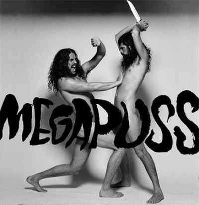
39. Megapuss: 'Surfing' – Venezuelan-American freak folk singer Devendra Banhart has always been avant-garde in his ways and no more so is the evident in his side project Megapuss. For the record sleeve, Devendra has stripped bollock naked and enacts attacking his equally hairy bandmate Gregg Rogrove with a knife. Very strange.
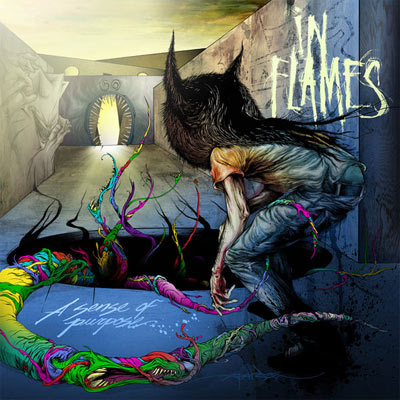
38. In Flames: 'A Sense of Purpose' %u2013 You'd think a Swedish rock band would have something a bit more hardcore on their album cover. Nope, they opted for a fantasy drawing of a kid with a hat on.
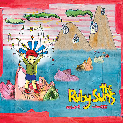
37. The Ruby Suns: 'Sea Lions' – The New Zealand indie-pop band have a history of crap album art. Their eponymous 2005 debut featured a child-like drawing of a giraffe, yet 'Sea Lions' from this year is a whole lot worse. True, it would be nice enough if your eight year old child drew it, but what possesses a band to use it on their album sleeve is beyond us.
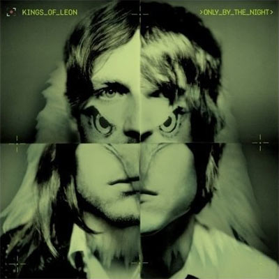
36. Kings of Leon: 'Only By The Night' - The album that truly propelled the Followills into an arena band (despite being their worst to date) was issued with a downright shit sleeve on European shores. Basically the four band members' face's merged in with a hawk, it's no wonder a different, more aesthetically pleasing sleeve was released in the US.
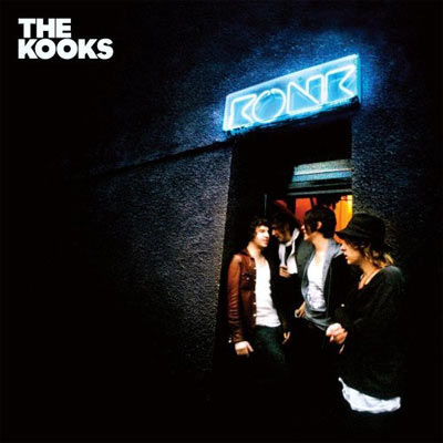
35. The Kooks: 'Konk' – A relative rarity for this list, the dreary, unimaginative sleeve for Konk (featuring the floppy haired foursome standing outside a nightclub) is nowhere near as bad as the soul-destroyingly irritating music that the record contains. Easily one of the worst albums of 2008.
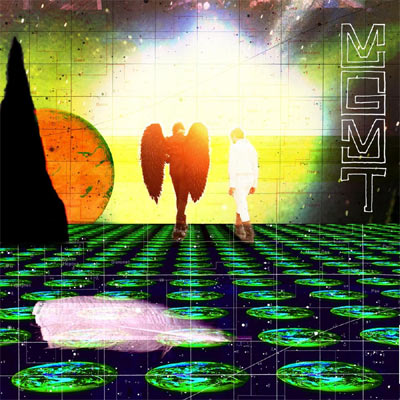
34. MGMT: 'Oracular Spectacular' – Although the physical album this year featured a palatable enough sleeve, the digital release from 2007 (okay, we're breaking the rules a bit here) is just plain hideous. A futuristic image of a man meeting an angel on a landscape of squashed planets, it looks like a shite Photoshop mock-up by someone who has been taking far too much acid.
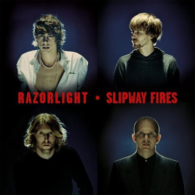
33. Razorlight: 'Slipway Fires' – Stalwarts of our worst album covers countdown's, 2008's abysmal (both musically and aesthetically) Slipway Fires is no exception. Serious as always, it depicts all four band members looking all solemn and pensive under flash lights. The main offender is Johnny Borrell, however, exposing his chest and with a constipated grimace on his slappable face. Push a little bit harder Johnny...
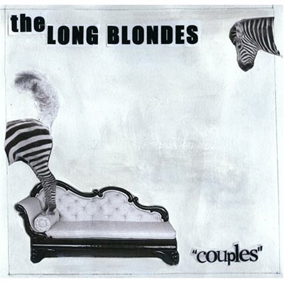
32. The Long Blondes: 'Couples' – Singer Kate Jackson is the culprit for this abomination of a sleeve. The now demised band's debut 'Someone To Drive A Sleeve' has a stylish, classy cover thanks to Jackson. But just two years later, she clearly lost the plot and all artistic ability!!
31. Sun Kil Moon: 'April' – An extremely serious band needs a serious album cover and Mark Kozelek's Sun Kil Moon didn't disappoint in that respect with 'April'. Four light bulbs in a darkened room – how profound!
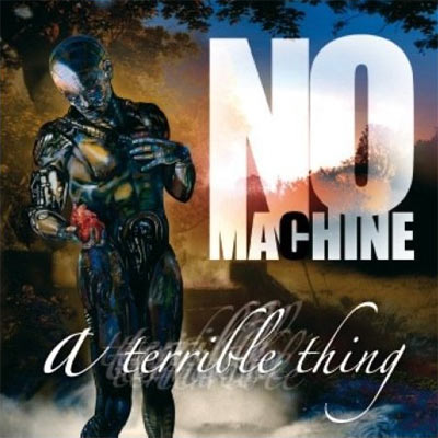
30. No Machine: 'A Terrible Thing' – On the plus side London's No Machine put a bit of effort in with this cover. But a robot, plucking a beating heart from his chest?! Give us a break.

29. Belphegor: 'Bondage Goat Zombie' – There are an abundance of turgid death metal sleeves to choose from (so many we could probably do a separate gallery), but this singularly sums up exactly what gets our goat. Demons, check. Garish lettering, check. Goats in suspenders, check.
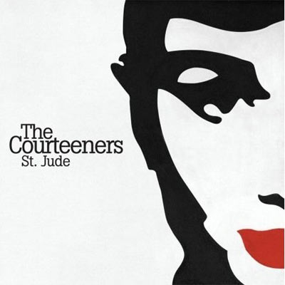
28. The Courteeners: 'St Jude' – They were predicted to be one of the great new bands of 2008, but in reality, despite moderate chart success, their career has wimpered like a farting balloon. The cover to their debut album was painted by singer Liam Fray and it's apparently of Audrey Hepburn. Not to aspiring indie bands; don't make your album sleeves yourselves!

27. Delays: 'Everything's The Rush – The Southampton band's third studio album was a gargantuan flop when it released in March of this year. The fact that they seemingly plagiarised an image from a pain relief advert for the album cover surely doesn't help matters.
26. Quinn Walker: 'Laughter's an Asshole/Lion Land' - Just like Santogold's 'spewing' sleeve this release from the Brooklyn based singer-songwriter is visual Marmite. For us, it just leaves a bitter taste.
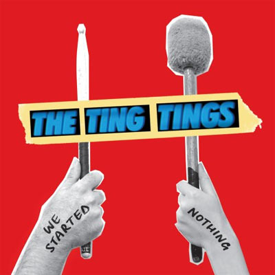
25. The Ting Tings: 'We Started Nothing' – The Salford band may know how to write a chart-cracking indie-pop song, but on a superficial level their artwork leaves a lot to be desired. A collage of Katie and Jules' hands holding drum sticks, it's far from profound, yet strangely suits the fun duo perfectly.
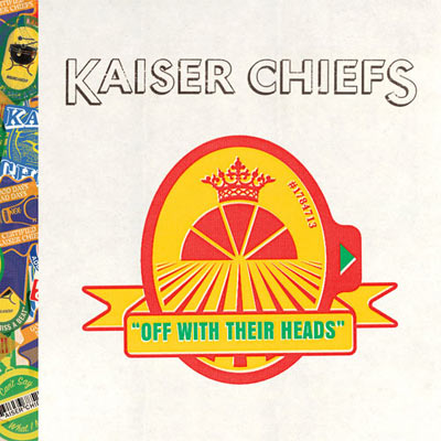
24. Kaiser Chiefs: 'Off With Their Heads' – Those pesky Kaiser Chiefs were back again in 2008 to inflict woe upon us with their third studio album. Not quite as offensive as the 'Yours Truly, Angry Mob' sleeve, the band emblem on the sleeve is both unimaginative and tacky.
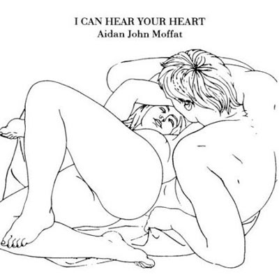
23. Aidan John Moffat: 'I Can Hear Your Heart' – Don't get us wrong, we're not against soft pornography on album covers. In fact, we're pretty much for it. Yet, when it's limited to a naff pencil sketch, it's underwhelming.

22. Cloud Cult: 'Feel Good Ghosts (Tea-Partying Through Tornados)' – An album with a painfully pretentious title naturally needs painfully pretentious artwork and the experimental indie-rockers succeeded emphatically with this. Come on tornado, whip them away...
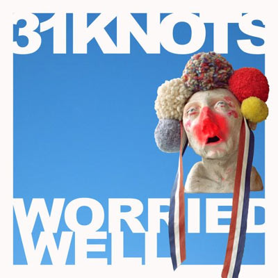
21. 31 Knots: 'Worried Well' – A downright bizarre idea for a record sleeve. Basically a red-faced orc like creature (whose facial expression suggests he may just be doing something naughty to himself) wearing bright coloured cotton balls and ribbons on his head. Indeed, the Portland rockers' album cover is just as weird as it is bad.
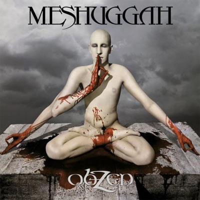
20. Meshuggah: 'obZen' - A three armed bald guy on a table slab, smeared with his own blood... we should have expected it from a band called Meshugga, a word which means deranged and senseless apparently. What crazy guys!
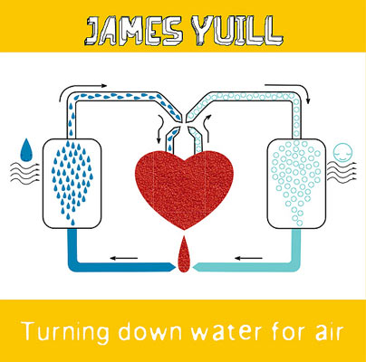
19. James Yuill: 'Turning Down Water For Air' – Lifted straight from a teenager's biology text book, the diagram purportedly visualises the benefits of, well, turning down water for air. Clever that.
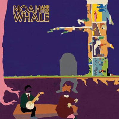
18. Noah And The Whale: 'Peaceful The World Lays Me Down' – Looking like it was drawn up on a crap computer 'paint' package, album covers don't get much worse than Noah and the Whale's debut. A shame because it detracts us from the oft sublime folksy music they concoct.
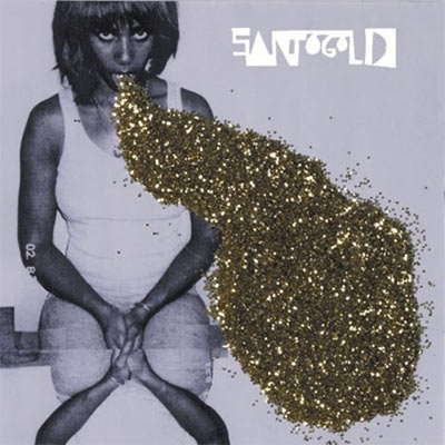
17. Santogold: 'Santogold' – A highly divisive album cover, some people love the black & white image of Santi White spewing up gold glitter, while others think it's the worst they've seen in a long time. After a quick hands up around the Gigwise staff, the majority of us think that it is indeed crap. Still, at least it's memorable.
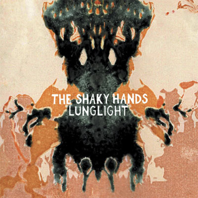
16. The Shaky Hands: 'Lunglight' – Fantastic band name, it's just a shame they haven't got the artwork to match. In fact when 'Lunglight' first landed at Gigwise towers a member of staff remarked “I could paint a picture better than that!†We reckon a four year old could.
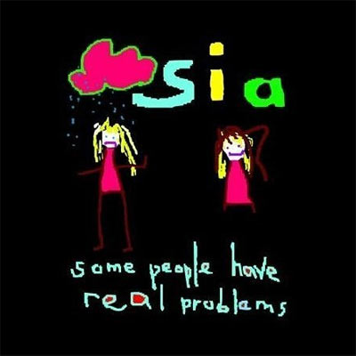
15. Sia: 'Some People Have Real Problems' – Handy tip: If you're going to use a kids' drawing for your album cover, make sure you pick an ankle biter who can actually draw! An alternative sleeve was released for the American edition of the album. We wonder why?!
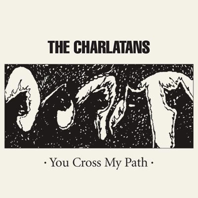
14. The Charlatans: 'You Cross My Path' – Originally released as a free download, when it came to the physical release it seems that the indie veterans didn't spend too long designing or choosing its artwork. What the hell is it?! Answers on a post card please.

13. Warmer Milks: 'Soft Walks' – Before we researched this gallery, Gigwise had never heard of Kentucky songsmith Warmer Milks, but after seeing this excuse of an album cover – basically a blurred photograph of a woman's face – he remains entrenched in our memory forever. Well, for a few weeks at least.
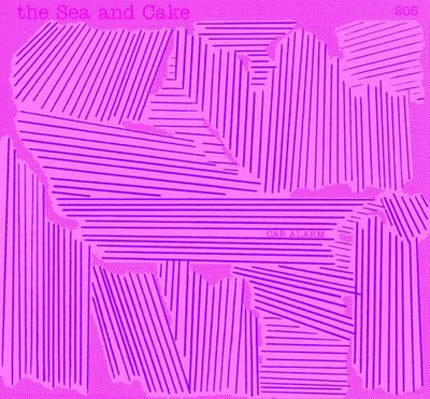
12.The Sea And Cake: 'Car Alarm' – Musically there's not much wrong with theses Chicago based jazzed-tinged indie types. That's more than can be said about their eighth studio album though. Fluorescent pink and with a bunch of lines and scrawls over it, it must have been designed in a nanosecond.
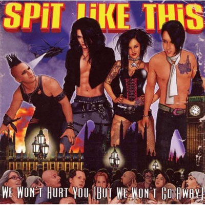
11. Spit Like This: 'We Won't Hurt (But We Won't Go Away)' – The terribly dressed band members as giants wreaking havoc on the streets of London, this is so bad it's cringeworthy. Please, please go away Spit Like This.
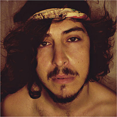
10. Ilya E Monosov: 'Seven Lucky Plays, or How to Fix Songs for a Broken Heart' – Not content with having the most turgid album title on this list, US based Monosov also has one of the worst album covers. Basically a close-up photo of his gormless face, it's utter shite.
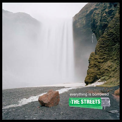
9. The Streets: 'Everything Is Borrowed' – A rock in front of a waterfall? Hardly an image synonymous with The Streets' music. We can't blame drugs for this diatribe of a record sleeve now Mike Skinner is clean, which begs the pertinent question; what the hell was he thinking when he chose this?! Spectacularly bad.
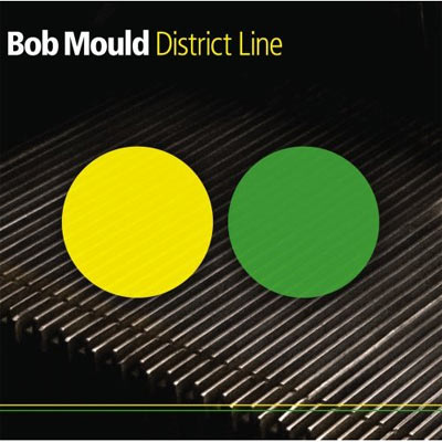
8. Bob Mould: 'District Line' – Basically a close up photo of an escalator step with two coloured circles blobbed on top, put simply, it's a turgid sleeve.

7. Vanilla Ice: 'Vanilla Ice Is Back! Hip-Hop Classics' – Back in 2008 with a dire covers album, the original white rapper didn't disappoint with Vanilla Ice Is Back! Admittedly more restrained and less garish than his sleeves from the early 90s, the fact that he's tried to be mature, but ultimately still looks like an idiot, warrants a place on this list.
6. Islands: 'Arm's Way' – The Montreal band left us all astounded when they unleashed 'Arm's Way' back in May thanks to its ridiculously overblown fantasy cover. In fact, thanks to a flurry of blog posts mocking it, the artwork is now far more famous than the band themselves. A shame.

5. The Superimposers: 'Harpsichord Treacle' – Looking like it was knocked up on Paintshop on the Amiga twenty years ago by a blind man with no hands or limbs, there are absolutely no redeeming features about this record cover.
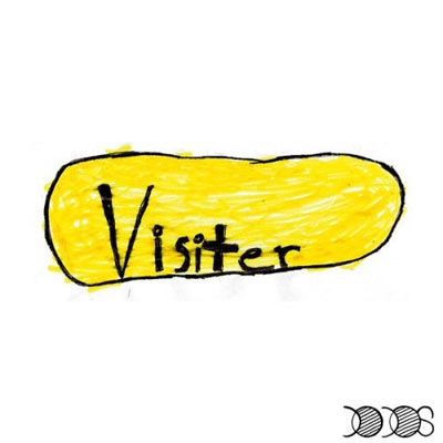
4. The Dodos: 'Visiter' – Taking minimalism to the extreme, San Francisco's The Dodos adorned their third studio album with a yellow blob and the word 'visitor' scribbled on in crayon. A truly terrible album cover.

3. Manda Rin: 'My DNA' – The former Bis singer has enjoyed limited success since the demise of her band a few years back. They say you can't judge a book by its cover, but would you buy this album after seeing this wretched front cover?

2. LL Cool J: 'Exit 13' – Tacky as hell, preposterous and overblown, the image of a giant microphone smashing into a highway is laughably bad. Widely panned by the critics, the artwork fits in perfectly with the music, then.
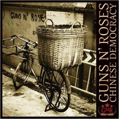
1. Guns N Roses: 'Chinese Democracy' – A rusty, battered old bike with a massive wicker basket on a run-down street, it's like something out of a Hovis advert! (a TV commercial set it the nineteenth century northern England for those American readers out there). The sleeve had people guffawing when it was first unveiled earlier this year and it still raises a laugh now.