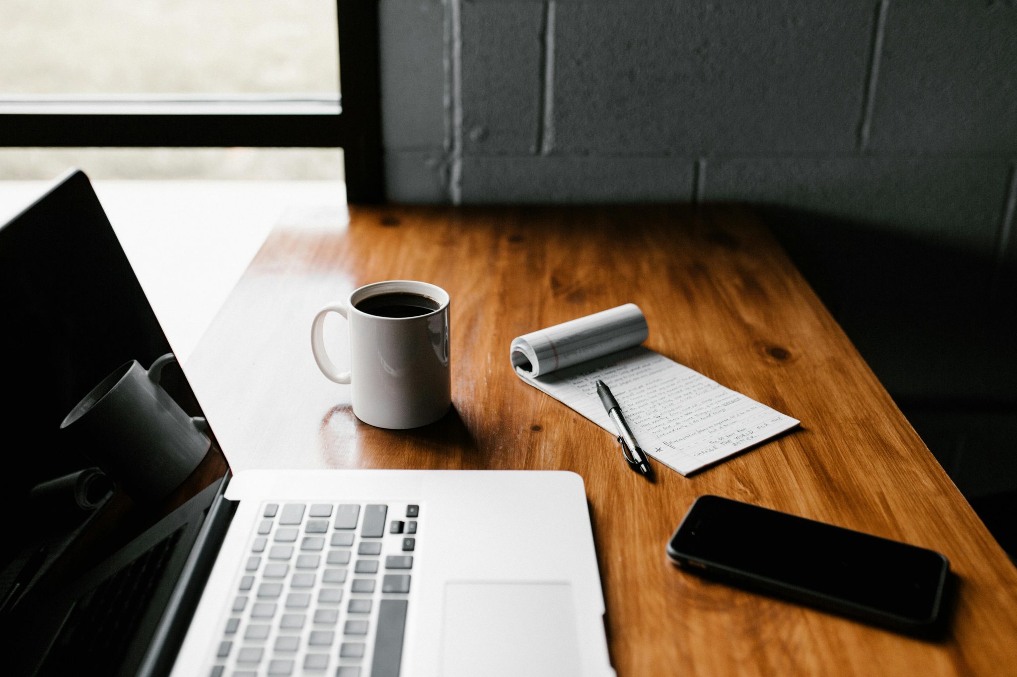
Most people design their first workspace around images they saved, not the actual rhythm of their workday. The result is a desk that looks sharp in photos but feels frustrating after three hours of real use.
The tension between aesthetics and practicality becomes obvious quickly, usually after the first week when back pain shows up or when the glare from a poorly placed window makes afternoon work unbearable.
The first workspace rarely works on the first try. That’s not failure. It’s part of the process. Iteration matters because you can’t predict friction points until you live with them. What looks clean in theory often collapses under daily demands. The real design begins after you notice what’s not working.
Understanding What You Actually Do All Day
Your workspace needs to reflect real habits, not an idealized version of productivity you hope to achieve. The space should support your behavior, not try to discipline it into shape. Before buying anything, map out what your day actually looks like.
The questions that force clarity include what tasks you repeat daily, how you handle focus work versus meetings, how often you switch between devices, and whether silence, background noise, or movement helps you maintain output.
Understanding these patterns determines desk layout, monitor placement, storage needs, and even chair mobility. If you spend six hours coding, your setup will differ from someone who juggles video calls and document editing. The workspace must accommodate what you do, not what you think you should be doing.
The Biggest Mistake Is Designing for Looks First

People overspend on decor before solving ergonomics, layout, cable flow, lighting, and seating. I did the same thing. The desk looked great. The chair matched. The art was minimal. But the monitor sat too low, the lamp created shadows across the keyboard, and the cable mess under the desk made every adjustment a frustrating tangle.
The first few weeks exposed every friction point. Aesthetic choices only matter after the foundation works. Looks are a layer, not the foundation. Start with what your body needs, what your workflow demands, and what keeps you working comfortably for hours. Design the functional core first.
The visual refinement comes later and costs less than you expect once the layout already works.
The Role of Ergonomics That Nobody Warns You About
Long work hours create back strain, wrist fatigue, and neck tension faster than most people anticipate. Ergonomics isn’t optional comfort. It’s the difference between sustainable work and chronic pain. The framework is simple: chair first, desk height second, monitor placement third. Everything else follows from these three anchors.
Why Screen Height Matters More Than You Expect
Your screen should sit at eye level or slightly below. Looking down for hours shortens neck muscles and causes headaches. Looking up strains your upper back. The adjustment seems minor until you realize how much tension disappears when the monitor sits at the right height.
Micro-Adjustments You Never Think About Until You’re Forced To
Keyboard tilt, mouse distance, armrest height, and footrest presence all affect how your body holds itself during work. These details feel invisible until something starts hurting. Small tweaks accumulate into real comfort over weeks of use.
Lighting Is The Silent Productivity Killer
Poor lighting affects mood and energy more than most people realize. Natural light placement, shadows, reflections, and color temperature all influence how long you can work without feeling drained.
Overhead lighting often creates harsh shadows and ruins the visual quality of the workspace. A warm desk lamp, adjustable key light, or even shifting the desk closer to a window makes a noticeable difference.
The best lighting setup layers multiple sources. Natural light from the side reduces glare. A task light provides focused brightness without overwhelming the room. Ambient light fills the space without creating hard shadows. Getting this balance right takes experimentation, but the payoff is immediate.
Storage and Surface Discipline
Clutter isn’t a personality flaw. It’s a design failure. Accessible, hidden, and vertical storage systems change how you work by keeping tools within reach without crowding the desk surface. Storage must be built around behaviors, not wishful minimalism. If you use something daily, it needs to live in an easy grab zone. If you use it weekly, it can go in a drawer. If you rarely touch it, get it off the desk entirely.
The reality is that surfaces fill up fast. Discipline helps, but smart storage prevents the problem from starting. Shelves, drawers, cable trays, and pegboards all serve different functions. The goal is to keep the desk surface almost empty while keeping everything you need close.
Cable Management and Workflow Flow
Cables ruin mental peace. They tangle, shift, and create visual noise that distracts more than you think. Simple fixes like under-desk trays, velcro wraps, and routing logic make a massive difference. Cable management makes the workspace look finished even when everything else is basic.
The approach is straightforward. Group cables by function. Route power separately from data. Use clips to hold cables in place. Keep slack minimal but present so you can adjust without disconnecting everything. The effort takes an hour, but the result lasts months and reduces frustration every time you move something.
Why Your First Desk Setup Always Fails
Version one is a prototype. That’s not pessimism. It’s realism. Trial, error, and daily friction reveal what the design actually needs. My first layout looked clean but forced me to reach too far for my notebook, placed the monitor at the wrong angle, and left no room for a second screen when I needed one.
Weekly adjustments led to the final layout. Moving the desk closer to the window improved lighting. Raising the monitor eliminated neck strain. Adding a small shelf created storage without sacrificing surface space. The process took time, but each change solved a real problem instead of chasing an aesthetic ideal.
Picking Gear That Fits Your Work Style
Tool choice depends on actual use, not what looks impressive or what someone else recommends. The questions that matter include whether you need a single monitor or dual setup, whether your workflow centers on a laptop or desktop, whether a standing desk or fixed desk fits your work style, and which accessories are essential versus impulse buys.
Think in terms of output. If you write all day, a large single monitor and a mechanical keyboard might matter more than a standing desk. If you edit video, dual monitors and a powerful desktop become priorities. If you take constant calls, a quality microphone and camera outweigh aesthetic purchases. Match the gear to the work, not the other way around.
How I Used Artificial Intelligence to Design Better
Modern AI tools elevated the workspace planning process without replacing the decisions themselves. AI didn’t design the space. It accelerated clarity by helping me explore options, compare tradeoffs, and test ideas faster than manual research allowed.
AI Search to Gather New Ideas
Using AI search engine made it easier to gather layout ideas, compare ergonomic data, explore niche solutions, and check product reviews without endless browsing. Instead of clicking through dozens of pages, I could ask specific questions and get consolidated answers.
Finding information on monitor arm compatibility, desk depth recommendations, and lighting temperature ranges took minutes instead of hours.
AI Chat to Think Aloud
AI Chat became a space to ask questions without judgment, explore tradeoffs, discuss layout options, test lighting ideas, and map decisions. I used it to challenge assumptions, talk through budget priorities, and refine themes before committing to purchases. The process felt like thinking out loud with someone who had infinite patience and no agenda.
How Both Together Helped Refine the Design
Using AI Search and AI Chat together helped refine color palettes, monitor setups, shelving ideas, room acoustics, and desk organization. The combination worked because one tool pulled information while the other helped process it. The result was faster iteration and fewer expensive mistakes.
Budgeting With Realistic Tradeoffs

I planned spending with a simple rule: invest in what touches your body and what influences daily workflow. That meant prioritizing the chair, desk, monitor, and lighting over decorative elements.
A quality chair costs more upfront but saves money on back pain and replacements. A good monitor reduces eye strain and improves focus. Proper lighting prevents headaches and fatigue.
Avoiding impulse aesthetics saved more money than expected. Wall art, plants, and decor can wait. They add value once the workspace functions well, but they don’t fix ergonomic failures or workflow friction. The budget should reflect priorities, not trends.
Final Layout Principles That Actually Worked
The principles that emerged from the design process became the foundation for everything else:
- Build for habits, not trends
- Light placement before decor
- Keep the desk surface almost empty
- Invest in core ergonomic pieces
- Treat layout as an evolving system
These rules simplified decision making and kept the focus on what mattered. They also made future adjustments easier because the foundation was already solid.
Closing Reflection
Building a workspace is both a personal identity project and an operational one. The space reflects how you work, but it also shapes how well you work. The right setup doesn’t make you more disciplined. It simply removes friction so discipline has room to work.
Iteration, awareness, and smart tools like AI Search and AI Chat shaped the final outcome by making the process faster and more intentional. The workspace you build in the first week won’t be the one you use in the sixth month, and that’s exactly how it should be.


