Your home’s exterior color is basically your house’s outfit and just like fashion, it can make or break your entire look. While we’re all scrolling through Instagram admiring celebrity homes and Pinterest-perfect facades, the truth is that choosing the right exterior color scheme is both an art and a science. It’s about making a statement that reflects your personality while ensuring your home looks effortlessly chic from the street.
The color trends dominating 2025 are all about sophisticated minimalism meets bold personality. Think clean, nature-inspired palettes with unexpected pops of drama. Whether you’re planning a complete exterior makeover or just refreshing your front door, the colors you choose will set the tone for your home’s entire aesthetic. And let’s be honest in today’s Instagram-obsessed world, your exterior needs to look as good in photos as it does in person.
Why Exterior Color is the Ultimate Curb Appeal Game-Changer
Let’s talk about why exterior color is having such a major moment right now. Your home’s color scheme is literally the first thing people notice, and it sets expectations before anyone even steps inside. It’s like wearing a killer outfit that makes you feel confident—the right exterior colors can transform your entire property’s vibe.
The psychology of color plays a huge role in how people perceive your home. Warm, welcoming colors like soft creams and earthy terracottas create an inviting atmosphere that makes guests feel instantly comfortable. Meanwhile, bold choices like deep navy or charcoal gray project confidence and sophistication that commands attention from every angle.
What’s really exciting about 2025’s color trends is how they balance Instagram-worthy aesthetics with practical considerations. The colors that are trending now aren’t just beautiful they’re also designed to photograph well, work with various architectural styles, and actually enhance your property value. It’s smart style that looks effortless but delivers real impact.
Regional climate considerations have also become part of the conversation. Colors that work beautifully in sunny California might look completely different in the moody Pacific Northwest, and savvy homeowners are choosing palettes that complement their local environment while still making a statement.
Trending Now: The Colors Everyone’s Talking About in 2025

Warm neutrals are absolutely having a moment, and we’re totally here for it. Think beyond basic beige—we’re talking about sophisticated mushroom grays, creamy off-whites with subtle undertones, and soft putty colors that feel both timeless and totally current. These colors photograph beautifully and work with virtually any accent color you want to add.
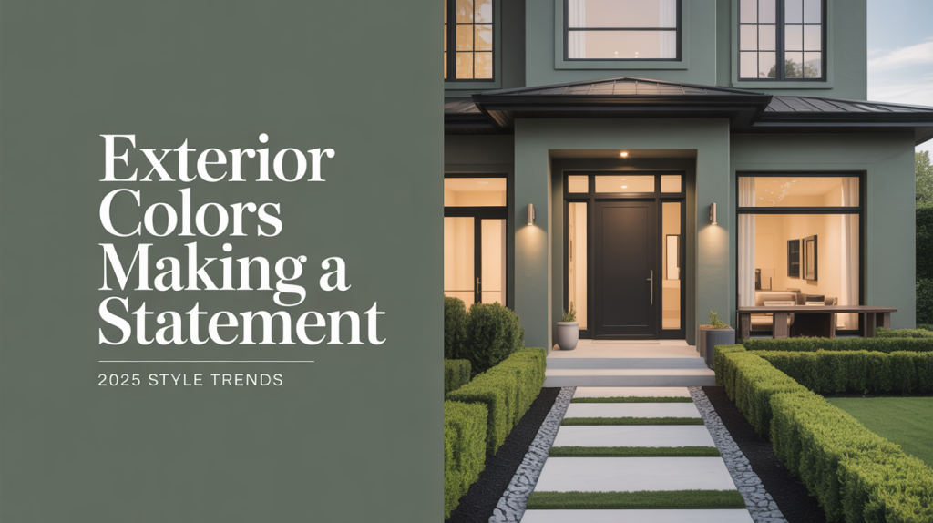
Earth tones are another major trend that’s showing up everywhere from high-end architectural magazines to celebrity home features. Terracotta is particularly having its moment it’s warm, sophisticated, and adds instant character to any home style. Sage green has also emerged as the neutral that isn’t really neutral, offering just enough color to feel fresh while remaining incredibly versatile. Designer-approved colour palettes for small Indian homes.
The bold accent strategy is where things get really fun. Instead of painting your entire home in a dramatic color, homeowners are choosing neutral bases and making statements with front doors, shutters, and trim. Navy blue front doors are everywhere right now they’re classic enough to feel timeless but bold enough to create serious curb appeal impact.
Biophilic design influence is showing up in exterior color choices too. We’re seeing more nature-inspired palettes that include stone grays, sky blues, and various shades of green that help homes feel connected to their natural surroundings. These colors work particularly well for homes with lots of landscaping or natural settings.
Global inspiration is also trending, with homeowners drawing from Mediterranean whites, Scandinavian grays, and even Moroccan-inspired earth tones. It’s about bringing worldly sophistication to your own neighborhood while respecting local architectural traditions.
Celebrity Home Inspiration: A-List Color Choices Worth Copying
Celebrities definitely know how to make a statement with exterior colors, and their choices often predict what’ll be trending for the rest of us. The sophisticated black and white combinations we’ve been seeing on luxury properties are filtering down to mainstream home design, creating timeless elegance that photographs beautifully.
Many celebrity homes feature the warm white trend we’re seeing everywhere—these aren’t stark, cold whites but creamy, inviting tones that feel luxurious without being pretentious. They’re often paired with natural wood elements and black metal accents for a look that feels both modern and approachable.
The farmhouse chic aesthetic that many stars have embraced translates beautifully to exterior colors. Warm whites with sage green shutters, natural wood elements, and touches of black create a look that feels both rustic and refined. This combination works particularly well for homes with traditional architectural elements.
What’s interesting about celebrity color choices is how they often balance bold personality with broad appeal. Many opt for sophisticated neutrals as their base colors but add personality through carefully chosen accent elements. This approach allows for personal expression while maintaining the kind of timeless elegance that photographs well and ages gracefully.
Contemporary celebrities are also embracing darker, more dramatic exterior colors like charcoal gray and deep navy. These choices feel confident and modern while still being sophisticated enough for upscale neighborhoods. When done right, dark exteriors can create stunning contrast with landscaping and make architectural details really pop.
Best Color Combinations That Never Go Wrong
Some color combinations are simply foolproof, and these classic pairings continue to deliver stunning results year after year. White and black remains the ultimate sophisticated combination—whether it’s crisp white siding with black trim or white brick with black shutters and doors. This pairing photographs beautifully and works with virtually any architectural style.
Cream and navy creates a timeless, coastal-inspired look that feels both classic and current. This combination works particularly well for traditional and transitional home styles, offering enough contrast to create visual interest without being overwhelming. Add some natural wood elements and you’ve got a look that could grace the cover of any design magazine.
Gray and white combinations offer endless possibilities, from light gray siding with crisp white trim to charcoal gray with warm white accents. The key is choosing grays with undertones that complement your home’s architectural style and surrounding landscape. Cool grays work beautifully in modern settings, while warmer grays suit traditional homes.
Earth tone combinations are having a major moment, with terracotta and cream creating warm, inviting exteriors that feel both sophisticated and approachable. Add some sage green accents through shutters or front door color, and you’ve got a palette that feels fresh and current while being rooted in natural beauty. Browse live examples on Beegru to see how top listings use these palettes in real homes.
For those wanting to make a bolder statement, deep green and cream creates a look that’s both dramatic and elegant. Forest green siding with cream trim feels classic yet unexpected, while sage green with white creates a softer, more contemporary vibe.
How to Choose Colors That Work for Your Home’s Style
Your home’s architectural style should definitely influence your color choices, but that doesn’t mean you’re locked into predictable combinations. Modern minimalist homes look stunning in clean whites with black or charcoal accents, but they can also handle more unexpected choices like warm gray with natural wood elements.
Traditional homes have the flexibility to embrace both classic and contemporary color schemes. While white with black shutters will always look elegant on a colonial, these homes can also handle more adventurous choices like sage green with cream trim or even sophisticated navy with white accents.
Farmhouse styles are perfect for warm, welcoming color palettes. Think cream siding with sage green shutters, warm white with natural wood elements, or even soft gray with white trim. These homes can handle earth tones beautifully and often look best when colors feel connected to the natural landscape.
Contemporary homes can embrace both minimalist and bold color approaches. Stark white with black accents creates a clean, gallery-like aesthetic, while charcoal gray with warm wood elements adds sophistication without being cold. These homes can also handle unexpected color combinations that might overwhelm more traditional styles.
Climate and regional considerations matter too. Colors that look stunning in bright, sunny climates might appear washed out in areas with less intense light. Similarly, dark colors that create drama in moderate climates might become overwhelming in very sunny locations.
Pro Tips for Making Bold Color Choices That Actually Work
If you’re ready to make a bold color statement, start with a neutral base and add drama through accent elements. This approach allows you to experiment with trending colors without committing to painting your entire home in a shade you might tire of quickly. A dramatic front door color can transform your home’s entire appearance while being relatively easy to change if your tastes evolve.
Consider your home’s lighting throughout the day when choosing colors. Colors that look perfect in morning light might appear completely different in the golden hour or under artificial evening lighting. Test paint colors at different times of day and in different weather conditions before making your final decision.
Think about your landscape and surroundings when selecting colors. Colors that complement your existing landscaping will create a cohesive, polished look, while colors that clash with your natural environment will always feel forced. If you’re planning landscape updates, coordinate your exterior color choices with your garden plans.
Quality matters significantly with exterior paint, so invest in high-grade options that will maintain their color and finish over time. Cheaper paints might save money upfront but often require more frequent touch-ups and full repainting, making them more expensive in the long run.
Don’t forget about trim and accent colors these elements can make or break your overall color scheme. Crisp, well-maintained trim in a complementary color will make your main color choice look intentional and polished, while poorly chosen or maintained trim colors can make even the best main color look sloppy.
Finally, remember that exterior color is just one element of your home’s overall curb appeal. The most beautiful color scheme won’t compensate for poor maintenance, outdated fixtures, or neglected landscaping. Think of your color choice as part of a comprehensive approach to creating a home exterior that truly makes a statement.


